In modern society, where the majority of internet users access the internet through their portable devices, your website must be optimized to work efficiently on all devices. Given the constantly expanding choice of smartphones and tablets, mobile testing is now a vital aspect of Web development. In this guide, you’ll discover the most effective mobile site tester tools out there and learn how you can effectively build your mobile site testing strategy.
Why Mobile Testing Matters

Now, before jumping straight into the tools, it is perhaps pertinent to talk a little more about why mobile testing is such a big deal.
- User Experience: People using mobiles must get integrated user experiences across their devices of choice.
- Search Engine Optimization (SEO): Google’s mobile-first indexing prioritizes mobile-friendly sites.
- Conversion Rates: A well-optimized mobile site can significantly improve conversions.
- Brand Reputation: Poor mobile experiences can damage your brand’s credibility.
Now, let’s explore the top mobile site tester tools that can help you achieve comprehensive mobile testing.
Top Mobile Site Tester Tools
It is imperative to make sure your website works properly on different devices in today’s mobile-first world. To assist you in providing a flawless mobile experience, here is a compilation of some of the best mobile site tester tools:
-
LambdaTest
LambdaTest is a versatile cloud-based platform that lets you test the functionality of your website on real mobile devices. It gives access to more than 3000 different device-browser combinations, so you can ensure that your site will look and work properly no matter the size of the screen, operating system, or browser used.
Key Features:
- Real device cloud testing
- Automated and manual testing on a wide range of devices
- Extensive browser and OS coverage
- Integration with popular automation frameworks like Selenium
In addition to real-time manual testing, LambdaTest offers seamless integration with automation tools like Selenium, enabling automated testing for mobile devices. It ensures that you can scale your mobile testing strategy and catch issues early in the development process.
Another key feature of LambdaTest is its ability to test on real devices from different geographies. This provides insights into how your website performs in different regions and network conditions. Whether you’re targeting local or global audiences, LambdaTest can help ensure a consistent mobile experience.
-
Google Mobile-Friendly Test

Key Features:
- Free and easy to use
- Provides a simple pass/fail result
- Offers specific suggestions for improvement
The first and by far the most straightforward and most simplistic tool that should form part of any mobile testing is Google’s Mobile-Friendly Test. It’s as easy as entering your URL, and the tool will check your site’s mobile friendliness. This feature provides a straightforward report, specifying whether your site is compliant or not with Google’s mobile-friendly criteria.
The tool also provides data regarding precise challenges that might be influencing your site’s mobile experience, including texts that are too small to be viewed, combined click zones, and broad content.
Though it does not offer detailed tests from different device perspectives, it is an excellent way to check what Google thinks about your site’s mobile compatibility.
-
Responsinator
Key Features:
- Free to use
- Quick visualization of responsive design
- Multiple device views on one page
Responsinator is a basic application that provides great value in case you need to view the look of any site you are developing on various mobile devices. Just input your URL, and Responsinator will give you a preview of your site as it looks on various devices, all on one page.
Responsinator, for example, does not include interactive testing or specific performance parameters, but it is perfect for a responsive redesign check across multiple resolutions. It’s particularly useful during the design phase to ensure your layout adapts well to different device dimensions.
-
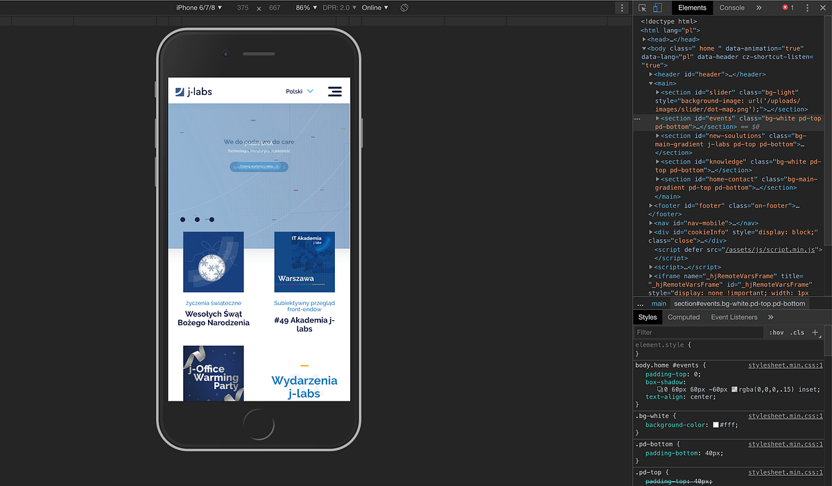
Chrome DevTools Device Mode
Source: medium.com
Key Features:
- Built into Chrome browser
- Emulates various devices and network conditions
- Offers detailed performance insights
- Free and easily accessible
Chrome’s built-in DevTools offers a powerful Device Mode for mobile testing. This feature allows you to emulate various mobile devices directly in your browser, complete with options to simulate different network conditions.
Key capabilities include:
- Responsive design testing with adjustable screen sizes
- Device-specific emulation (e.g., iPhone, iPad, Pixel)
- Network throttling to test performance under various connection speeds
- CPU throttling to simulate less powerful devices
Chrome DevTools provides particularly valuable performance insights. You can analyze loading times, identify render-blocking resources, and pinpoint performance bottlenecks specific to mobile devices.
-
Lighthouse
Key Features:
- Open-source and free
- Comprehensive performance audits
- Generates detailed reports with improvement suggestions
- Available as a Chrome extension or in Chrome DevTools
Lighthouse, an open-source tool developed by Google, needs to be used for extended mobile performance audits. It takes running a set of audits for your page and consistently provides a report on its performance, accessibility, PWA, SEO, etc.
Although Lighthouse cannot be described specifically as a mobile testing tool, it does offer mobile audits and can emulate mobile devices and a slow connection. Despite this, the detailed reports offer data on how to improve your site’s mobile performance, making it useful for developers and site owners.
-
GTmetrix
Key Features:
- Detailed performance analysis
- Mobile testing options
- Historical data tracking
- Free and premium plans available
GTmetrix is a comprehensive website performance testing tool that includes mobile testing capabilities. It provides detailed insights into your site’s loading speed, page size, and overall performance.
For mobile testing, GTmetrix allows you to:
- Test your site using mobile user agents
- Simulate various connection speeds
- Compare mobile vs. desktop performance
The historical data tracking feature is particularly useful for monitoring your site’s mobile performance over time, helping you identify trends and the impact of optimizations.
-
Screenfly

Source: jimmyweb.net
Key Features:
- Free to use
- Tests across multiple screen resolutions
- Simple and intuitive interface
Screenfly by QuirkTools is a straightforward, responsive design testing tool. It enables you to see how your site would look depending on the size of the screen used – from a small mobile phone screen to a big desktop screen.
It does not have as many features as some of the other tools out there, but because of this, Screenfly is perfect for a fast check while developing. It is very beneficial for designers and developers who wish their responsive layouts were crosschecked across different screen sizes.
-
Mobility Test by Mobilemoxie
Key Features:
- Simulates mobile search results
- Tests geo-specific mobile results
- Compares results across devices
Mobility Test by Mobilemoxie stands out from the rest of the tools as it solely highlights how a site looks in a mobile context by showing how the site appears in a mobile search. These tools enable you to mimic searching from a number of locations and on different devices, thus providing you with important information regarding the kind of SEO that your site will undergo in a mobile setting.
This tool is very helpful to businesses focusing on local markets or those who are worried about their position in mobile search. To use and compare search results across devices and locations, you better approach the mobile SEO strategy for further visibility and click-through rates.
-
Pingdom
Key Features:
- Website speed testing
- Performance grade and recommendations
- Multiple test locations
- Free and premium plans
While not exclusively a mobile testing tool, Pingdom offers valuable insights into your website’s performance that are crucial for mobile optimization. It provides a detailed breakdown of loading times, page sizes, and individual request performance.
For mobile testing, Pingdom allows you to:
- Test from various global locations to simulate user experiences in different regions
- Receive a performance grade based on best practices
- Get actionable recommendations for improving mobile performance
The ability to test from multiple locations is particularly useful for businesses with a global audience, as it helps ensure consistent performance across different geographic regions.
-
WebPageTest

Source: kinsta.com
Key Features:
- Detailed performance metrics
- Multiple test locations and browsers
- Advanced testing options
- Free and open-source
WebPageTest is a powerful, open-source tool that offers in-depth performance testing capabilities. While it covers both desktop and mobile testing, its mobile features are exceptionally robust.
Key mobile testing features include:
- Testing on real mobile devices
- Simulating various network conditions
- Comparing performance across multiple mobile browsers
- Generating video of the page load process
WebPageTest’s advanced options allow for highly customized tests, making it a favorite among performance-focused developers and analysts.
Creating a Comprehensive Mobile Testing Strategy

Having learned the best mobile site tester tools in this article, it is good that we discuss how to form a systematic mobile testing plan:
- Start with the basics: Google’s Mobile-Friendly Test and Responsinator can help you easily check how mobile-friendly your site is and whether it is responsive.
- Dive deeper with emulators: Utilize Chrome DevTools Device Mode for more detailed emulation and performance testing.
- Perform real device testing: Use LambdaTest or similar services to test on real mobile devices, ensuring real-world compatibility.
- Analyze performance in-depth: Employ tools like Lighthouse and GTmetrix to get detailed performance metrics and improvement suggestions.
- Check search visibility: Use a Mobility Test to understand how your site appears in mobile search results across different locations.
- Monitor over time: Regularly use tools like Pingdom or WebPageTest to track your site’s mobile performance and identify trends or issues.
- Test across multiple dimensions: In your testing, consider factors such as different devices, browsers, network conditions, and geographic locations.
- Automate where possible: Implement automated testing using tools like LambdaTest’s Selenium integration to catch issues early in the development process.
- Don’t neglect user testing: While automated tools are invaluable, nothing beats real user feedback. Conduct user testing sessions with a variety of mobile devices.
- Stay updated: Mobile technologies and best practices evolve rapidly. Regularly update your testing strategy and tools to stay current.
Conclusion
Today, being mobile first means that having a website that is responsive to the devices that people use is important. Mobile testing is essential in enhancing the usability/usability, SEO, and conversion optimization of your website.
As you can see, there is a wide range of tools that can be used to evaluate websites, starting from the absolute basics with free services like Google’s Mobile-Friendly Test and ending with advanced cross-browser testing tools like LambdaTest; used together, all of these tools can provide a solid approach to testing that encompasses performance, functionality, and user experience.
Keep in mind that mobile-friendly does not only mean good looks; the site also has to perform well on every possible front—interface, load time, compatibility with mobile devices, browsers, and connections. In this way, you would be able to proactively address issues and guarantee that your site provides the best mobile experience possible through constant site performance checks and automated testing to the extent possible.