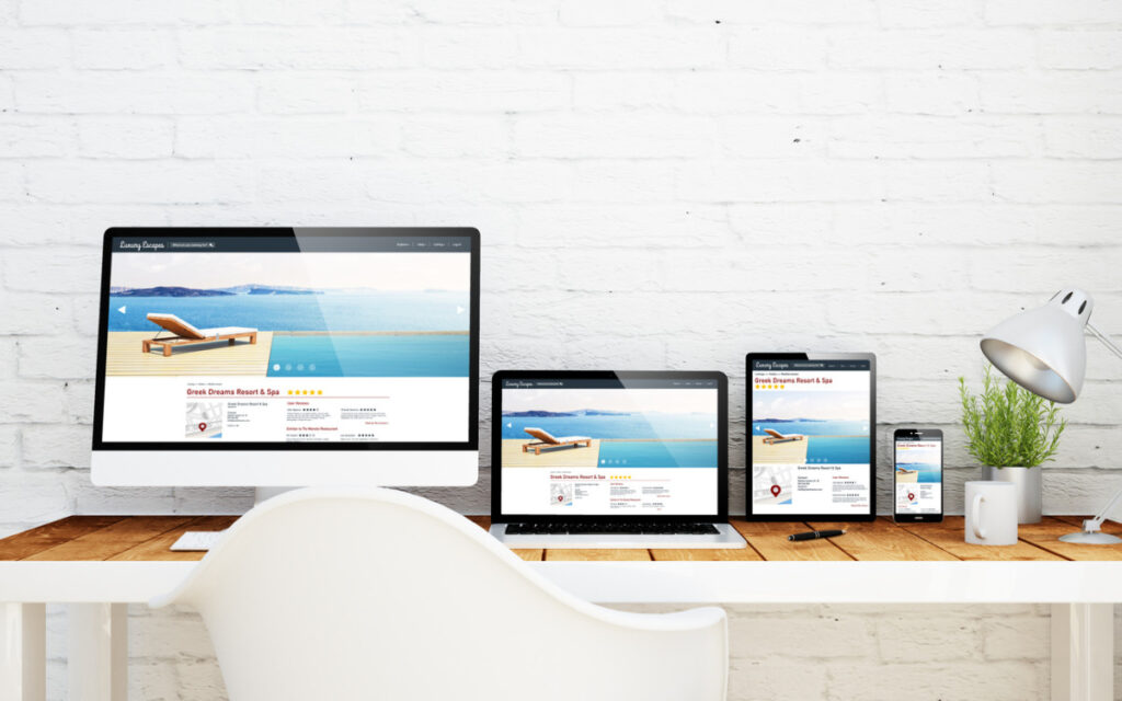
Too much clutter on your online platform can send users running. Pop-ups, endless navigation options, and more colors than a rainbow—none of it guarantees success. In fact, it might be killing your results.
Let’s talk about why a simpler approach could bring more leads, sales, and satisfied visitors. Spoiler ─ Less really is more.
Key Points
- A crowded layout can overwhelm users.
- Simple designs keep attention focused.
- Streamlining boosts speed and usability.
- Fewer distractions mean better sales opportunities.
- Professional help can make the transition seamless.
Are You Trying Too Hard to Impress?
People often think packing every feature imaginable into an online space is the way to win customers. The truth? Visitors only care about their experience. If they can’t find what they’re looking for fast, they’ll leave.
Instead of trying to do everything, ask local web design experts in Birmingham for help. MacMedia Marketing specializes in transforming cluttered sites into clean, responsive platforms that customers love. They know how to streamline your layout without sacrificing personality.
Why Simplifying Works
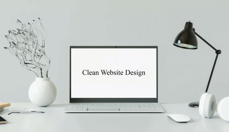
A simple approach works because it removes decision fatigue. When users have fewer choices, they are more likely to take action. That might mean buying your product, signing up for your newsletter, or booking a consultation.
What Does Simplification Involve?
- Reducing unnecessary menus and links.
- Choosing fewer fonts and colors.
- Prioritizing fast loading times.
- Highlighting one primary call-to-action per page.
Take a look at successful brands. They rarely overwhelm visitors with too much content. Instead, they focus on clarity.
How Visual Noise Hurts Conversion Rates
Too many graphics, pop-ups, or irrelevant content can hurt user experience. It’s like walking into a store that plays three different songs at once, all at maximum volume. You want to leave as soon as possible.
A visually calm design ensures that users focus on what’s important: your product or service.
Steps to Achieve a Clean Layout
- Audit your current platform for unnecessary elements.
- Decide what absolutely needs to stay.
- Use whitespace to guide attention.
- Limit content to the essentials.
If in doubt, prioritize simplicity over “cool features.” Visitors are there for solutions, not distractions.
The Power of Whitespace
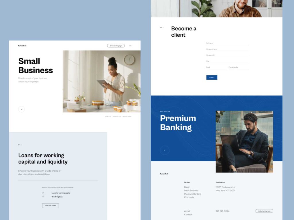
Whitespace isn’t wasted space. It’s a strategic tool. Spacing out elements allows users to process information better. Without it, everything blends together, making it hard to focus.
Whitespace also creates a polished look. When used correctly, it conveys professionalism and trustworthiness.
Speed Matters
A cleaner layout loads faster. Studies show that users abandon platforms that take longer than three seconds to load.
By reducing elements, you ensure that your platform performs efficiently. Speed isn’t just nice; it’s essential.
Tips for Faster Load Times
- Compress images.
- Avoid autoplay features.
- Use simple layouts.
- Choose reliable hosting services.
Case Studies Prove Simpler Wins
Real-world examples highlight the benefits of simplicity. Brands that embrace cleaner layouts see higher engagement and better customer feedback.
One study showed a 15% boost in sales after a company switched to a cleaner design. Another company doubled newsletter sign-ups after removing unnecessary graphics.
Common Questions About Cleaner Designs
Will a simpler design hurt creativity?
No. You can still showcase creativity through visuals and content. Simplicity doesn’t mean boring; it means focused.
Do all platforms benefit from minimalism?
Most do. However, industries like entertainment or gaming might need vibrant layouts.
How much does a redesign cost?
Costs vary depending on the size of the project. Professional designers can give you a detailed quote.
Simplification Is the Key to Better Results
Cluttered layouts distract and frustrate users. A clean approach keeps attention on your message, leading to better results. If you’re struggling to know where to start, ask experts to guide the process.
Keep it simple. Focus on clarity. Watch your results improve.

